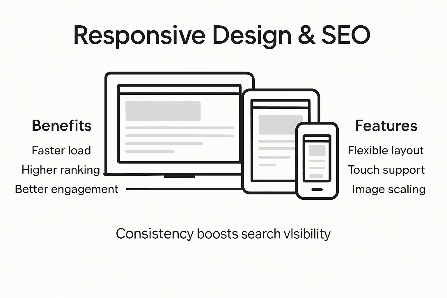
Importance of Responsive Design for SEO Success


More than 65 percent of online shoppers now make purchases from mobile devices, with American consumers ranking among the most active. For small and mid-sized e-commerce businesses, ignoring mobile responsiveness risks massive drops in organic traffic and customer trust. With new device categories and user expectations emerging each year, this guide reveals the latest responsive design strategies that help futureproof your digital presence and keep your brand competitive worldwide.
Table of Contents
- What Responsive Design Means in 2026
- How Responsive Layouts Impact User Experience
- SEO Benefits of Mobile-Friendly Websites
- Risks and Costs of Ignoring Responsiveness
- Best Practices for Effective Responsive Design
Key Takeaways
| Point | Details |
|---|---|
| Responsive design is essential for diverse devices | Websites must adapt not only to screen sizes but also to various device types, including foldable smartphones and augmented reality. |
| User experience is paramount | Implementing responsive design significantly improves usability, leading to higher engagement and satisfaction across different platforms. |
| SEO benefits from mobile optimization | Mobile-friendly websites rank better on search engines, resulting in lower bounce rates and higher conversion potential. |
| Neglecting responsiveness incurs risks | Ignoring responsive design can lead to decreased traffic, lost customers, and increased costs, damaging brand perception and sales. |
What Responsive Design Means in 2026
Responsive design has transformed from a simple screen adaptation strategy to a sophisticated, multifaceted approach addressing complex digital user experiences. In 2026, websites must do more than resize content – they need to intelligently respond to diverse technological ecosystems. Modern responsive design now encompasses adaptive layouts, performance optimization, and deep accessibility integration.
The technological landscape now demands websites that dynamically adjust not just across screen sizes, but across entire device categories. Emerging screen types like foldable smartphones, wearable tech, and augmented reality interfaces require layouts that are fundamentally flexible. Responsive design in 2026 goes beyond traditional breakpoints, utilizing container-based layouts where individual components independently adapt to available space.
Key technological shifts driving responsive design include:
- Advanced performance optimization techniques
- Server-side rendering for faster mobile experiences
- Conditional logic for context-aware interfaces
- Touch-friendly interaction models
- Seamless integration with assistive technologies
The most successful responsive designs will prioritize not just visual compatibility, but holistic user experiences that feel native across different devices and interaction paradigms.
Here's how responsive design approaches compare across different device types:
| Device Type | Key Design Consideration | Unique Challenge |
|---|---|---|
| Foldable Smartphones | Flexible layouts for split screens | Transition between modes |
| Wearable Tech | Minimal content for small displays | Limited interaction space |
| Augmented Reality | Context-aware overlay design | 3D space integration |
| Desktops/Laptops | Multi-column layouts | Multiple input methods |
| Tablets | Adaptive touch and keyboard input | Varying orientation usage |
Pro tip: Conduct quarterly responsive design audits using real device testing to ensure your website maintains optimal performance across emerging technology platforms.
How Responsive Layouts Impact User Experience
Responsive design fundamentally transforms digital interactions by creating seamless experiences across multiple devices. Flexible grid systems and adaptive media queries enable websites to dynamically adjust content presentation, significantly enhancing user accessibility and engagement. This approach goes beyond simple screen resizing, focusing on creating intuitive, user-friendly interfaces that work effortlessly regardless of device type.
The impact of responsive layouts extends far beyond visual aesthetics. Research among university students demonstrates that responsive design substantially improves usability, with nearly all mobile users preferring interfaces that adapt smoothly to their device's screen. Key user experience improvements include:
- Consistent navigation across devices
- Faster page loading times
- Improved readability
- Touch-friendly interaction elements
- Reduced cognitive load when switching between devices
Successful responsive design requires continuous testing and optimization. Websites must anticipate user behavior across diverse technological environments, from smartphones and tablets to desktop computers and emerging technologies like wearable devices. This means creating layouts that are not just visually appealing, but functionally intelligent and context-aware.

Pro tip: Implement comprehensive device testing protocols that simulate real-world usage scenarios to identify and resolve responsive design challenges before they impact user experience.
SEO Benefits of Mobile-Friendly Websites
Mobile-friendly websites have become a critical component of search engine optimization strategies, directly impacting a site's visibility and ranking potential. Mobile SEO strategies have evolved to prioritize websites that deliver seamless experiences across different device types, with search engines increasingly favoring responsive designs that adapt quickly and effectively.
The primary SEO advantages of mobile-friendly websites include:
- Improved search engine rankings
- Lower bounce rates
- Enhanced user engagement metrics
- Faster page loading speeds
- Higher conversion potential
- Increased time-on-site duration
Google's mobile-first indexing approach means that websites without robust mobile optimization will experience significant ranking penalties. Search algorithms now evaluate mobile performance as a primary ranking factor, considering elements like page speed, responsive design, and touch-friendly interfaces. Websites that fail to meet these mobile-friendly criteria risk substantial organic traffic losses and diminished search engine visibility.
Successful mobile SEO requires a holistic approach that combines technical optimization, content adaptability, and user-centric design. This means creating websites that not only look good on mobile devices but also provide intuitive navigation, fast loading times, and content that reads naturally across different screen sizes.
Pro tip: Conduct monthly mobile performance audits using Google's PageSpeed Insights and mobile-friendly test tools to identify and quickly resolve potential optimization issues.
Risks and Costs of Ignoring Responsiveness
Businesses that neglect responsive design expose themselves to significant financial and reputational risks in an increasingly mobile-driven digital landscape. Institutional research demonstrates that ignoring responsiveness can trigger substantial operational inefficiencies and escalate user disengagement rates, creating a cascading negative impact on organizational performance.
The primary risks of non-responsive websites include:
- Dramatic drop in search engine rankings
- Substantial increase in bounce rates
- Reduced user engagement
- Potential loss of up to 61% of mobile visitors
- Decreased conversion rates
- Negative brand perception
- Higher customer acquisition costs
The financial implications of ignoring responsiveness extend far beyond immediate user experience. Companies may face increased development costs for retroactive fixes, potential revenue losses from reduced conversions, and long-term brand reputation damage. Proactive responsive design is not just a technical requirement but a critical business strategy for maintaining competitive advantage.
Below is a summary of responsive design's business impacts versus the risks of ignoring it:
| Responsive Design Adopted | Responsive Design Ignored |
|---|---|
| Improved search ranking | Drop in organic traffic |
| Higher conversion rates | Lost mobile customers |
| Increased brand trust | Damaged reputation |
| Lower support costs | Higher long-term development cost |
| Competitive advantage | Missed market opportunities |
Pro tip: Allocate quarterly budget for comprehensive responsive design audits to identify and preemptively address potential user experience gaps before they impact business performance.
Best Practices for Effective Responsive Design
Modern responsive design demands a strategic approach that goes beyond simple screen resizing. Developers must create flexible, intelligent layouts that adapt seamlessly across diverse device environments, prioritizing user experience and performance optimization. This requires a comprehensive understanding of advanced design techniques and emerging technological standards.Key responsive design best practices include:
- Adopt a mobile-first design strategy
- Use fluid grid systems
- Implement flexible image techniques
- Create touch-friendly interface elements
- Utilize scalable vector graphics (SVGs)
- Define smart, content-driven breakpoints
- Prioritize content visibility and hierarchy
Successful responsive design requires continuous learning and adaptation. Designers must stay current with evolving CSS features, embrace minimalist aesthetics, and develop a deep understanding of user interaction patterns across different screen sizes and interaction modalities.
Pro tip: Develop a comprehensive device testing matrix that includes at least 12 different device types and screen sizes to ensure true responsiveness and compatibility.
Accelerate Your SEO Success with Responsive Design and AI Automation
The article highlights the critical impact of responsive design on SEO performance and user engagement. Businesses face challenges like losing mobile traffic, lower search rankings, and damaged brand trust when neglecting the seamless experience modern users expect. If your goal is to improve search engine visibility while delivering fast, adaptable, and user-friendly interfaces, embracing a strategic, mobile-first approach is essential. Responsive design is not just about fitting content to screens but about creating intelligent, context-aware digital experiences that keep visitors engaged and coming back.
Ready to transform your SEO strategy and outpace competitors with AI-driven content and backlinks tailored for every device? Explore how Babylovegrowth.ai simplifies organic growth by automating high-quality, Google-optimized articles coupled with a robust backlinks ecosystem that boosts rankings and conversions. Discover our step-by-step SEO method designed to keep your website responsive, fast, and optimized across all platforms. Don’t wait for lost traffic and shrinking visibility to catch up. Start your free trial now and ensure your digital presence stays perfectly responsive and optimized for 2026 and beyond.
Frequently Asked Questions
What is responsive design and why is it important for SEO?
Responsive design is a web development approach that ensures a website adapts seamlessly to various device sizes and types. It is important for SEO because search engines prioritize mobile-friendly websites, improving search rankings and user engagement.
How does mobile-friendliness affect search engine rankings?
Mobile-friendliness affects search engine rankings as algorithms favor sites that provide excellent user experiences on mobile devices. Poor mobile optimization can lead to lower visibility and higher bounce rates.
What are the main benefits of having a mobile-friendly website?
The main benefits of a mobile-friendly website include improved search engine rankings, enhanced user engagement, lower bounce rates, and higher conversion rates, all of which contribute to overall SEO success.
How can I test if my website is responsive and mobile-friendly?
You can test if your website is responsive and mobile-friendly using tools like Google's Mobile-Friendly Test and PageSpeed Insights. These tools evaluate your website's performance on mobile devices and provide actionable insights for improvement.
Recommended
Smart SEO,
Faster Growth!
Most Read Articles

Generative Engine Optimization (GEO)
Learn how Generative Engine Optimization (GEO) helps your content rank in AI search engines like ChatGPT and Google AI. This comprehensive guide explains the differences between SEO and GEO, why it matters for your business, and practical steps to implement GEO strategies for better visibility in AI-generated responses.
DylenJan 18, 2025
Track LLM Traffic in Google Analytics 4 (GA4)
Learn how to track and analyze traffic from AI sources like ChatGPT, Claude, Perplexity, and Google Gemini in Google Analytics 4. This step-by-step guide shows you how to set up custom filters to monitor AI-driven traffic and make data-driven decisions for your content strategy.
DylenMar 18, 2025
How to Humanize AI Text with Instructions
Learn practical techniques to make AI-generated content sound more natural and human. This guide covers active voice, direct addressing, concise writing, and other proven strategies to transform robotic text into engaging content.
DylenApril 7, 2025
Open AI Revenue and Statistics (2024)
Comprehensive analysis of OpenAI financial performance, user engagement, and market position in 2023. Discover key statistics including $20B valuation, $1B projected revenue, and 100M+ monthly active users.
DylenOctober 03, 2025