How to Create Effective Infographics for Better SEO Results


Every digital marketer knows that grabbing attention online can feel like an endless challenge. With audiences scrolling quickly and competition rising, visual storytelling with purposeful infographics has become an essential strategy for standing out in the crowded e-commerce world. The right infographic does more than decorate a page—it delivers meaningful insights, solves real problems, and encourages sharing, all while advancing your SEO goals. This guide outlines actionable steps to transform your data into compelling, high-performing visual assets.
Table of Contents
- Step 1: Define Infographic Goals For Your Audience
- Step 2: Research Data And Key Visual Elements
- Step 3: Select The Right Infographic Layout And Style
- Step 4: Design Compelling Visuals And Clear Messaging
- Step 5: Optimize Infographics For Seo And Sharing
- Step 6: Evaluate Infographic Performance And Refine
Quick Summary
| Key Point | Explanation |
|---|---|
| 1. Define Your Infographic Goals | Clearly understand your audience's expectations to create a focused infographic that effectively communicates your core message. |
| 2. Gather Accurate Data and Visuals | Use credible sources and relevant visuals to transform complex information into engaging narratives that capture audience attention. |
| 3. Choose the Right Layout and Style | Select layouts that best represent your content type, ensuring clarity and guiding viewer understanding through effective visual design. |
| 4. Create Engaging Visuals and Messaging | Design with simplicity in mind; use clear typography and consistency to make complex data memorable and easy to follow. |
| 5. Optimize for SEO and Sharing | Implement keyword strategies and mobile responsiveness to enhance your infographic's discoverability and sharing potential across platforms. |
Step 1: Define infographic goals for your audience
Creating an effective infographic starts with crystal-clear goal setting. Your mission is to design a visual communication tool that delivers precise insights while keeping your specific audience's needs front and center.
Understanding your audience's expectations is crucial for crafting an impactful infographic. Target audience research helps you determine the right approach. Consider these key factors when defining your goals:
- Audience knowledge level: Are they beginners or experts?
- Information consumption preferences: Do they prefer charts, icons, or data visualizations?
- Primary objectives: Educate, persuade, or entertain?
The purpose of your infographic will directly influence its design and content strategy. For instance, an infographic aimed at students might prioritize simplicity and educational clarity, while a marketing-focused graphic might emphasize compelling statistics and persuasive visuals.
The most successful infographics solve a specific problem or answer a compelling question for their target audience.
When mapping out your goals, ask yourself specific questions: What single most important takeaway do you want your audience to remember? How can your visual design make that message memorable and engaging?
Pro tip: Sketch a rough outline of your infographic's core message before diving into detailed design work to maintain laser-focused clarity.
Step 2: Research data and key visual elements
Gathering authoritative data and selecting the right visual elements are critical steps in creating an impactful infographic. Your goal is to transform complex information into a compelling visual narrative that captures and retains audience attention.
Effective infographic research requires a systematic approach to data collection and visualization. Consider these key strategies for finding and presenting your information:- Credible sources: Academic journals, government databases, and reputable research institutions
- Data relevance: Information directly supporting your infographic's core message
- Visual representation: Charts, graphs, icons that simplify complex concepts
When selecting visual elements, match your graphics to the data type. For numerical data, use bar charts or pie graphs. For comparative information, consider side-by-side illustrations or timelines. Infographics thrive on clear, intuitive visual communication.
The right visual can transform dry statistics into an engaging, memorable story.
Pay attention to color schemes, typography, and design hierarchy. Your visuals should guide the viewer's eye naturally through the information, creating a seamless narrative flow that makes complex data instantly understandable.

Pro tip: Cross-reference your data points with at least three independent sources to ensure accuracy and credibility.
Step 3: Select the right infographic layout and style
Choosing the perfect layout and style is like architecting a visual roadmap that guides your audience through complex information. Your infographic's design must not just look good but strategically communicate your core message.
Infographic design principles reveal several critical considerations for selecting the right layout. Different content types demand unique visual approaches:- Statistical infographics: Best for presenting numerical data and comparisons
- Timeline layouts: Ideal for showing historical progression or sequential events
- Process infographics: Perfect for explaining step-by-step workflows
- Comparison designs: Excellent for highlighting differences between concepts
The visual style you select should complement your information's nature. Minimalist designs work well for technical content, while more colorful approaches suit creative or marketing-oriented topics. Pay close attention to color psychology and how different palettes can evoke specific emotional responses.
Here's a summary of infographic layout types and their best uses:
| Layout Type | Ideal For | Visual Advantage |
|---|---|---|
| Statistical | Presenting numbers and data | Highlights key figures visually |
| Timeline | Showing historical progression | Clarifies sequences over time |
| Process | Explaining step-by-step workflows | Makes complex steps easy to follow |
| Comparison | Contrasting options or concepts | Emphasizes differences clearly |
Your layout is the silent storyteller that guides your audience's understanding.
Consider your audience's visual literacy and design preferences. A technical audience might appreciate precise, data-driven layouts, while a younger demographic might respond better to more dynamic, interactive visual structures.
Pro tip: Create a rough wireframe sketch of your infographic layout before diving into detailed design to ensure logical information flow.
Step 4: Design compelling visuals and clear messaging
Crafting an infographic is more than just throwing data onto a page - it's about creating a visual narrative that instantly captures and retains audience attention. Your design must transform complex information into an intuitive, engaging experience.
Visual communication strategies reveal critical principles for designing impactful infographics. Focus on these essential design elements:
- Typography: Clean, readable fonts that complement your content
- Color palette: Strategically chosen colors that evoke the right emotional response
- Visual hierarchy: Guiding the viewer's eye through important information
- Graphic consistency: Matching icons and illustrations that create a cohesive look
Simplicity is the ultimate sophistication in infographic design. Avoid cluttering your visual space with unnecessary elements. Each graphic, icon, and text block should serve a specific purpose in communicating your core message.
The most powerful infographics tell a story without overwhelming the viewer.
Pay special attention to your messaging. Use concise, punchy text that complements your visuals. Think of your words as supporting actors to the graphical lead - they should enhance understanding without stealing the spotlight.
Pro tip: Create a monochromatic color palette with 2-3 shades to maintain visual consistency and professional polish.
Step 5: Optimize infographics for SEO and sharing
Transforming your infographic from a static design to a powerful SEO and social media asset requires strategic optimization. Your goal is to make your visual content discoverable, shareable, and valuable across multiple digital platforms.
SEO optimization strategies focus on maximizing your infographic's digital reach. Consider these critical techniques:
- Keyword integration: Use relevant search terms in file names and descriptions
- Metadata enhancement: Add descriptive alt text and HTML tags
- Mobile responsiveness: Ensure the design looks great on all device sizes
- Embed options: Create easy-to-share code snippets for other websites
Properly attributed and sourced infographics build credibility and encourage natural backlink generation. Include clear references for your data points, which not only supports your content's authenticity but also improves search engine visibility.
Strategic optimization transforms infographics from visual content to powerful SEO assets.
Consider multiple distribution channels. Social media platforms, industry blogs, and professional networks can dramatically expand your infographic's reach. Each platform offers unique opportunities to showcase your visual storytelling.
Pro tip: Create a compressed, web-optimized version of your infographic to ensure fast loading speeds across different platforms.
Step 6: Evaluate infographic performance and refine
Creating an outstanding infographic is only half the journey. The real magic happens when you systematically track, analyze, and continuously improve your visual content based on real-world performance data.
Performance tracking strategies provide critical insights into your infographic's impact. Focus on these key evaluation metrics:
- Engagement rates: Likes, shares, comments across platforms
- Traffic generation: Visitor numbers and time spent viewing
- Conversion metrics: Click-throughs and lead generation
- Audience feedback: Direct comments and survey responses
Analyzing these metrics reveals not just how your infographic performs, but uncovers opportunities for strategic refinement. Look for patterns in viewer interaction, identifying which sections capture attention and which might need redesigning.
Compare popular infographic performance metrics and what they reveal:
| Metric | Measures | Insights Provided |
|---|---|---|
| Engagement Rate | Likes, shares, comments | Content resonance with audience |
| Traffic Generation | Visitors and average view time | Attractiveness of the infographic |
| Conversion Metrics | Click-throughs, leads captured | Persuasiveness of messaging |
| Audience Feedback | Direct comments and survey responses | Qualitative user preferences |
Data-driven refinement transforms good infographics into exceptional visual storytelling tools.
Don't view your infographic as a static asset. Treat it as a living document that evolves with audience preferences and emerging trends. Regular updates keep your content relevant and maintain its SEO value.
Pro tip: Set up Google Analytics goals specifically for your infographic to track precise performance indicators and user interactions.
Boost Your Infographic SEO With AI-Powered Content Solutions
Creating effective infographics to improve SEO requires clear goals, precise data, and optimized visuals that engage your audience while driving organic traffic. If you find mastering these steps challenging or want to accelerate your results, Babylovegrowth.ai offers an innovative AI-driven platform designed to simplify your SEO journey. Benefit from automated, high-quality content optimized for both Google and ChatGPT, a personalized 30-day content plan, and an integrated backlinks exchange ecosystem that complements your infographic strategy.
Ready to transform your infographics into powerful SEO assets that rank higher and attract more visitors? Visit Babylovegrowth.ai now and discover how our all-in-one SEO automation tools can elevate your visual content performance. Start your free trial today and turn your data-driven stories into unstoppable organic growth!
Frequently Asked Questions
What are the main goals for creating effective infographics for better SEO results?
Creating effective infographics begins with setting clear goals, such as educating, persuading, or entertaining your audience. Define what you want viewers to remember and how visuals can enhance that message, which helps maximize engagement.
How do I research data for my infographic?
To research data effectively, focus on credible sources like academic journals and government databases that are directly relevant to your infographic's message. Collect relevant statistics and visual representations that simplify complex information for your target audience.
What are the best layout styles for infographics?
The best layout styles depend on the content type you wish to convey. For example, use statistical layouts for numerical data, timelines for historical events, and process infographics for step-by-step explanations to create an organized flow of information.
How can I optimize my infographic for SEO?
To optimize your infographic for SEO, integrate relevant keywords in file names and descriptions, and enhance metadata with alt text and HTML tags. This ensures your infographic is discoverable and shareable across multiple platforms, increasing your online visibility.
What metrics should I track to evaluate my infographic's performance?
Track key metrics like engagement rates, traffic generation, conversion metrics, and audience feedback to evaluate your infographic's performance. Monitoring these metrics allows you to identify areas for improvement and adapt your content strategy accordingly.
Recommended
Smart SEO,
Faster Growth!
Most Read Articles
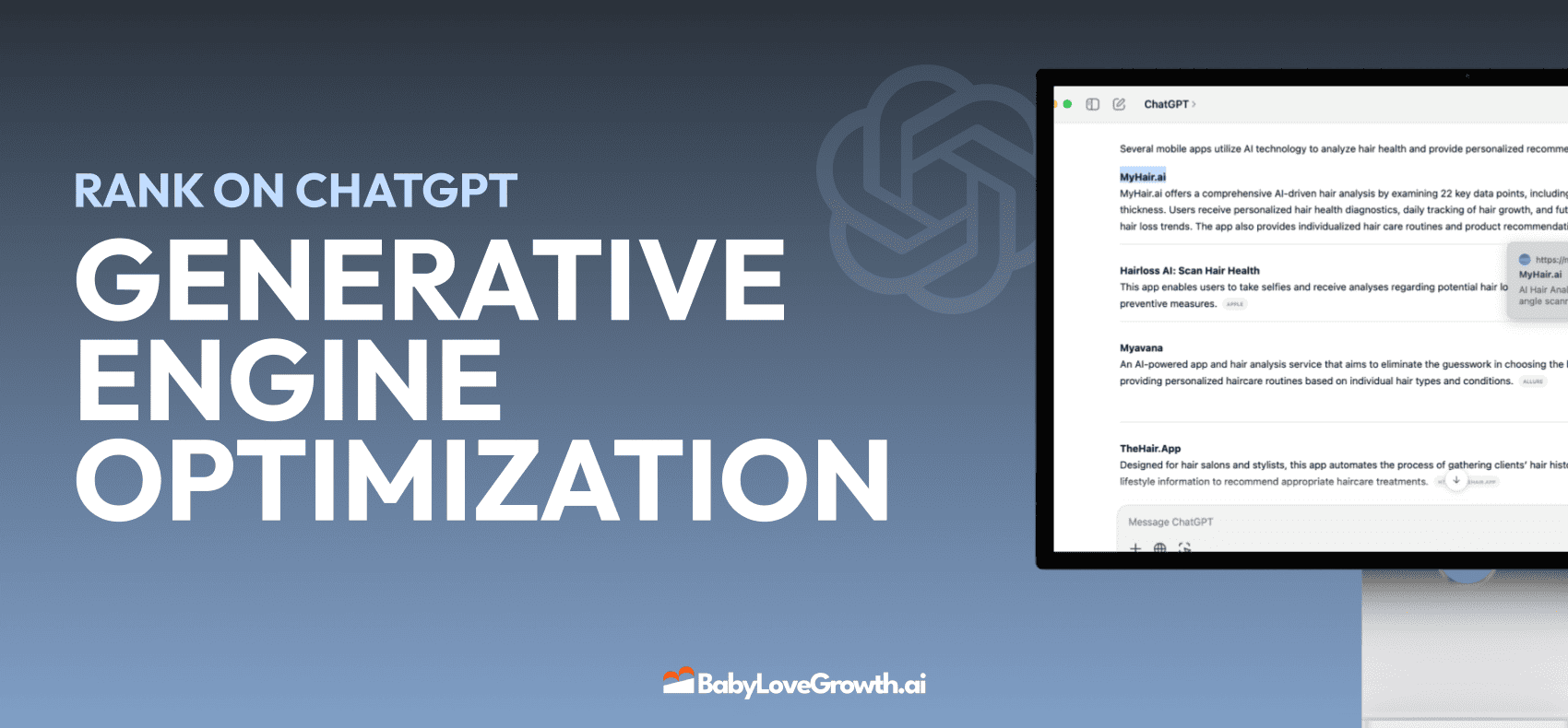
Generative Engine Optimization (GEO)
Learn how Generative Engine Optimization (GEO) helps your content rank in AI search engines like ChatGPT and Google AI. This comprehensive guide explains the differences between SEO and GEO, why it matters for your business, and practical steps to implement GEO strategies for better visibility in AI-generated responses.
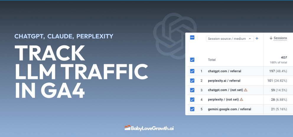
Track LLM Traffic in Google Analytics 4 (GA4)
Learn how to track and analyze traffic from AI sources like ChatGPT, Claude, Perplexity, and Google Gemini in Google Analytics 4. This step-by-step guide shows you how to set up custom filters to monitor AI-driven traffic and make data-driven decisions for your content strategy.
How to Humanize AI Text with Instructions
Learn practical techniques to make AI-generated content sound more natural and human. This guide covers active voice, direct addressing, concise writing, and other proven strategies to transform robotic text into engaging content.
Open AI Revenue and Statistics (2024)
Comprehensive analysis of OpenAI financial performance, user engagement, and market position in 2023. Discover key statistics including $20B valuation, $1B projected revenue, and 100M+ monthly active users.