How to craft effective CTAs for higher conversions in 2026


Digital marketers face a persistent challenge: crafting calls to action that genuinely convert. Too often, CTAs fall flat, failing to inspire clicks or drive meaningful engagement despite careful content strategy. The difference between a high-performing CTA and one that gets ignored often comes down to strategic preparation and execution. This guide reveals actionable strategies to transform your CTAs from overlooked buttons into powerful conversion drivers. You'll discover how to align messaging with audience psychology, optimize placement for maximum visibility, and continuously refine your approach based on performance data.
Table of Contents
- Understanding What Makes A Call To Action Effective
- Preparing Your Content And Audience Insights Before Crafting CTAs
- Step-By-Step Process To Craft And Implement Effective CTAs
- Verifying Effectiveness And Optimizing Your CTAs Continuously
- Boost Your CTA Strategy With BabyLoveGrowth Automation Tools
- Frequently Asked Questions
Key takeaways
| Point | Details |
|---|---|
| Strategic clarity wins | Effective CTAs use precise, action-oriented language that eliminates confusion about next steps. |
| Audience alignment matters | Tailoring CTA messaging to specific pain points and desires dramatically improves engagement rates. |
| Placement drives performance | Positioning CTAs at high-intent moments in the user journey maximizes conversion potential. |
| Testing reveals winners | Continuous A/B testing and data analysis identify the most effective CTA variations for your audience. |
| Design impacts action | Visual prominence, color contrast, and button size significantly influence whether users click. |
Understanding what makes a call to action effective
Effective CTAs share core characteristics that separate them from generic prompts. Clarity and motivation are essential components of CTAs that drive action. Your CTA must communicate exactly what happens when someone clicks, using concrete action verbs that eliminate ambiguity. Instead of vague phrases like "Learn More," specify the value: "Download Your Free SEO Checklist" or "Start Your 30-Day Trial."
Relevance to audience context determines whether your CTA resonates. A visitor reading about email marketing best practices expects CTAs related to email tools, templates, or guides. Mismatched CTAs create cognitive friction that kills conversions. Match your CTA to the specific stage of the customer journey. Top-of-funnel content needs educational CTAs, while bottom-of-funnel pages warrant direct purchase or demo requests.
Psychological triggers amplify CTA effectiveness when applied strategically. Urgency creates motivation through time-limited offers or scarcity messaging. Exclusivity appeals to desire for special access or insider benefits. Social proof reinforces trust by highlighting how many others have taken action. These triggers work best when genuine rather than manufactured.
Visual design makes CTAs impossible to miss. Contrasting colors draw the eye immediately to your CTA button. Whitespace around the CTA prevents visual clutter from diluting attention. Size matters, particularly on mobile devices where touch targets need adequate dimensions. Your CTA should stand out as the primary action on any page.

User intent alignment ensures CTAs feel like natural next steps. Someone researching solutions wants comparison guides or case studies. Someone ready to buy needs pricing information or signup forms. Forcing premature commitments through aggressive CTAs damages trust and increases bounce rates.
Pro Tip: Test your CTA by asking whether a stranger could understand the exact outcome within two seconds of seeing it. If there's any confusion, simplify your messaging until the action and benefit are crystal clear.
Preparing your content and audience insights before crafting CTAs
Successful CTAs emerge from deep audience understanding rather than guesswork. Start by identifying specific pain points your target customers experience daily. What frustrates them about current solutions? What goals do they struggle to achieve? Audience-centric messaging improves CTA engagement by speaking directly to these concerns. Document these insights in a reference sheet you can consult during CTA creation.
Align your CTA messaging with overarching content goals before writing a single word. If your article educates readers about conversion optimization, your CTA should offer related resources like templates, tools, or advanced guides. This alignment creates a seamless experience where the CTA feels like a logical continuation rather than an interruption. Review your content calendar to ensure CTAs support broader campaign objectives.
Map CTAs to specific customer journey stages for maximum relevance. Awareness stage visitors need educational content that builds trust. Consideration stage prospects want detailed comparisons and case studies. Decision stage leads require clear paths to purchase or signup. Using the wrong CTA for the journey stage creates friction that stops conversions cold.
Your brand voice should remain consistent across all CTAs. A playful, casual brand sounds jarring when CTAs suddenly turn formal and corporate. Conversely, professional B2B brands lose credibility with overly casual CTAs. Define tone guidelines that specify appropriate language, formality level, and personality traits for your CTAs.
Understanding call to action importance in your overall marketing strategy helps prioritize CTA development. Create a preparation checklist covering these elements:
- Documented audience pain points and desires
- Content goals and campaign objectives
- Customer journey stage for each piece of content
- Brand voice and tone guidelines
- Competitor CTA analysis for inspiration
- Available offers and resources to promote
| Preparation Element | Why It Matters | Action Required |
|---|---|---|
| Audience research | Ensures messaging resonates with real needs | Survey customers, analyze support tickets |
| Journey mapping | Matches CTA intensity to readiness level | Document typical paths to conversion |
| Offer inventory | Provides compelling reasons to click | List all lead magnets, trials, demos |
| Voice guidelines | Maintains brand consistency | Define tone, formality, personality |
Pro Tip: Interview your sales team to discover which phrases and benefits resonate most during customer conversations. These real-world insights often reveal CTA language that converts better than marketing assumptions.
Step-by-step process to craft and implement effective CTAs
Crafting high-converting CTAs follows a systematic approach that removes guesswork. Start by defining your objective with precision. Are you generating leads, driving sales, encouraging content downloads, or building email lists? Each goal requires different messaging and design approaches. Write down your specific objective before touching design tools.
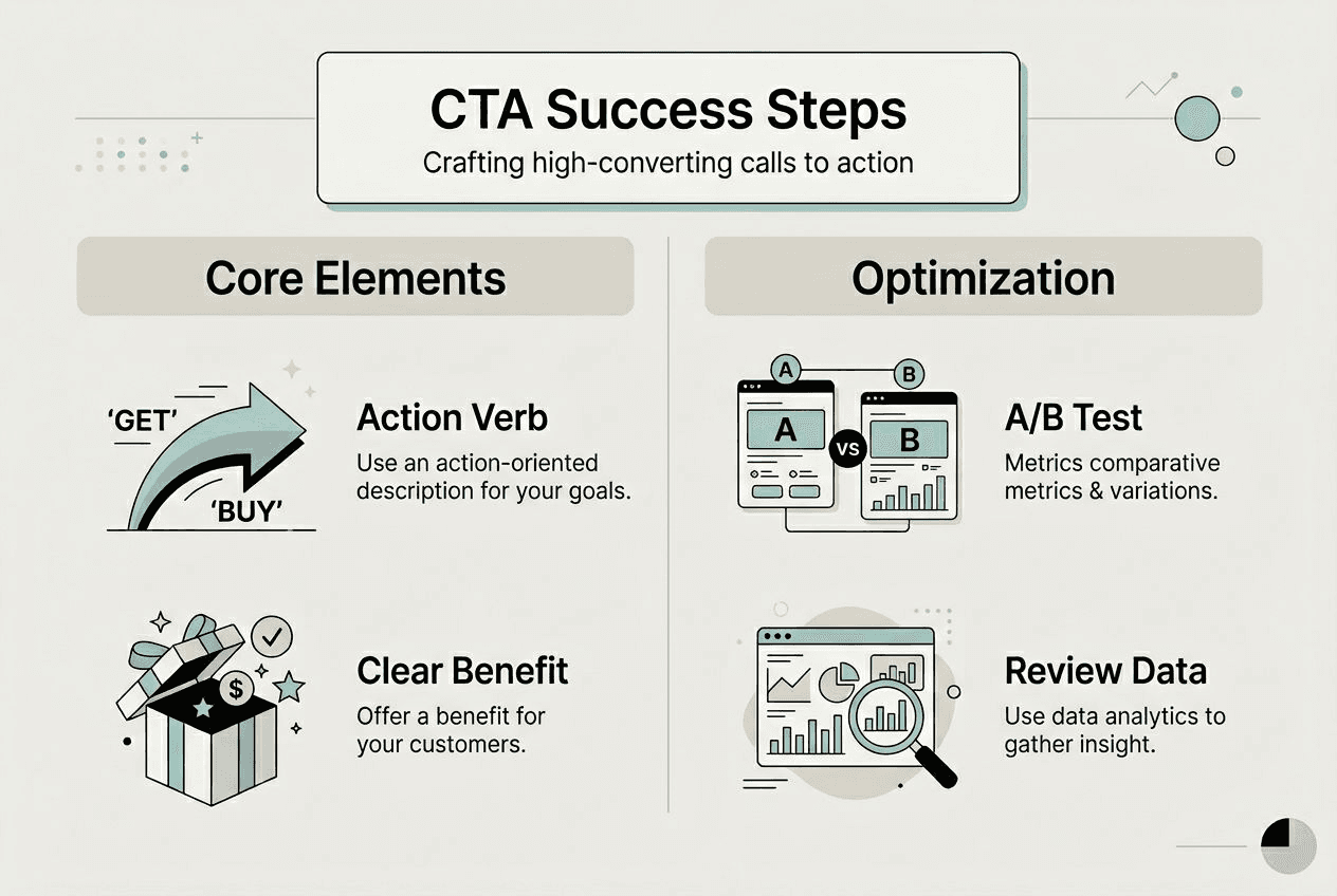
Next, craft your message using the formula: action verb plus clear benefit. "Get" or "Download" work better than passive language. Specify what users receive: "Get Your Free Audit" beats "Submit Form." Keep it brief, typically two to five words maximum. Every extra word dilutes urgency and clarity.
Select design elements that make your CTA visually dominant. Choose button colors that contrast sharply with surrounding content. Test different sizes, ensuring mobile users can easily tap without frustration. Add subtle shadows or borders to create depth that draws attention. Your CTA button should be the most noticeable element within its section.
Strategic CTA placement and wording significantly increase conversion rates when optimized properly. Position your primary CTA where user intent peaks. For long-form content, place CTAs after delivering substantial value. Short landing pages perform best with above-the-fold placement. Consider these positioning options:- Above the fold for immediate visibility on landing pages
- After the introduction to capture engaged readers
- Mid-content following key value delivery
- End of article when readers have consumed full value
- Sidebar for persistent visibility during scrolling
- Exit-intent popups to capture abandoning visitors
| CTA Placement | Best Use Case | Conversion Potential |
|---|---|---|
| Above the fold | High-intent landing pages | Very high for warm traffic |
| After introduction | Blog posts, guides | Moderate, captures engaged readers |
| Mid-content | Long-form articles | High after value delivery |
| End of content | Educational content | High for convinced readers |
| Sidebar | Multi-page websites | Moderate, provides consistent access |
| Exit-intent popup | All page types | Moderate, last chance engagement |
Wording and tone adapt based on your audience and medium. B2B audiences respond to professional, benefit-focused language. B2C consumers prefer emotional, urgent messaging. Social media CTAs can be casual and conversational. Email CTAs need to overcome inbox skepticism with clear value propositions. Study digital marketing techniques 2025 to understand evolving best practices.
A/B testing reveals which CTA variations perform best with your specific audience. Test one element at a time: color, copy, placement, or size. Run tests long enough to achieve statistical significance, typically at least two weeks or 1,000 visitors per variation. Track click-through rates, conversion rates, and downstream metrics like revenue per visitor.
Balance urgency without creating pressure that feels manipulative. Time-limited offers work when genuine, but fake countdown timers damage trust. Scarcity messaging succeeds when based on real limitations. Focus on positive framing: "Join 10,000 marketers" beats "Don't miss out."
Pro Tip: Create a swipe file of high-performing CTAs from your tests and competitors. Reference this file when crafting new CTAs to build on proven approaches rather than starting from scratch each time.
Verifying effectiveness and optimizing your CTAs continuously
Measuring CTA performance requires clear KPIs aligned with business objectives. Track click-through rate to measure initial engagement. Monitor conversion rate to assess how many clicks become desired actions. Calculate revenue per visitor for CTAs tied to purchases. Continuous testing and optimization improve CTA outcomes over time through data-driven refinement.
Heatmaps reveal exactly how users interact with your CTAs. These visual tools show where visitors click, how far they scroll, and which elements attract attention. If users scroll past your CTA without engaging, placement needs adjustment. If they hover without clicking, your messaging may lack clarity or appeal. Heatmap data removes guesswork from optimization decisions.
User feedback provides qualitative insights that numbers alone miss. Survey visitors who didn't convert to understand their hesitation. Ask customers what convinced them to click. Review session recordings to observe real user behavior around CTAs. These insights often reveal friction points invisible in aggregate data.
Common CTA mistakes sabotage conversion potential despite good intentions. Vague language creates uncertainty about outcomes. Poor color contrast makes CTAs blend into backgrounds. Wrong placement positions CTAs where user intent is low. Multiple competing CTAs on one page split attention and reduce overall conversions. Audit your CTAs against these pitfalls regularly.
Iterate your CTA copy and design based on performance data rather than opinions. If a variation increases conversions by 15%, make it your new control and test against it. Small improvements compound over time into significant gains. Document what works and what fails to build institutional knowledge.
Schedule regular review cycles to prevent CTA stagnation. Monthly reviews work well for high-traffic sites. Quarterly reviews suit smaller properties. During reviews, analyze performance trends, test new variations, and update CTAs to reflect current offers and messaging. Set calendar reminders to ensure reviews happen consistently.
Diagnosing underperforming CTAs requires systematic analysis. Low click-through rates suggest visibility or messaging problems. High clicks but low conversions indicate issues with the landing page or offer. Segment data by traffic source, device type, and user behavior to identify specific problem areas. Different audiences often require different CTA approaches.
Pro Tip: Create a CTA performance dashboard that tracks key metrics in real time. This visibility helps you spot problems quickly and capitalize on winning variations before competitors catch up.
Boost your CTA strategy with BabyLoveGrowth automation tools
Crafting effective CTAs represents just one piece of your digital marketing success. Scaling your efforts requires automation tools that amplify reach without multiplying workload. BabyLoveGrowth's SEO automation platform streamlines content creation and optimization, helping you generate more opportunities for high-converting CTAs across your digital properties.

Organic visibility determines how many potential customers ever see your carefully crafted CTAs. Our backlink building software establishes the authority signals that boost search rankings, driving qualified traffic to your conversion-optimized pages. Combined with our organic traffic tool, you gain data-driven insights that reveal exactly which content and CTAs generate the best returns. These automation solutions free you to focus on strategy while technology handles execution at scale.
Frequently asked questions
What is the ideal length for a call to action?
Short, clear CTAs typically perform best, usually between two and five words. Focus on conveying a single, compelling action that eliminates any confusion about what happens next. Brevity increases urgency and makes CTAs scannable, particularly on mobile devices where screen space is limited.
How often should I test and update my CTAs?
Test CTAs regularly, ideally monthly for high-traffic sites or with every new marketing campaign. Use analytics data to inform timely adjustments based on actual performance rather than assumptions. Seasonal changes, new offers, and evolving audience preferences all warrant CTA updates to maintain relevance and effectiveness.
Should CTA design differ across devices?
Yes, optimize CTA size, placement, and wording for mobile versus desktop viewing experiences. Responsive design ensures accessibility and engagement regardless of device type. Mobile CTAs need larger touch targets, simpler copy, and prominent positioning since mobile users scroll differently than desktop visitors.
How many CTAs should appear on a single page?
Limit pages to one primary CTA to avoid splitting visitor attention and reducing overall conversions. Secondary CTAs can support different user intents but should be visually subordinate to your main conversion goal. Multiple competing CTAs of equal prominence create decision paralysis that kills action entirely.
What colors work best for CTA buttons?
High-contrast colors that stand out from your page's color scheme perform best, with orange, green, and red commonly succeeding. However, the optimal color depends on your specific brand palette and surrounding design elements. Test different options with your actual audience rather than relying on generic color psychology claims.